


What the Heck, Let's Have a Little Kit Chat
It's never too early


This is one hell of an album cover, isn’t it?
I have a lot of issues with the branding of the Red Bull-Bora-Hansgrohe team. Not least of which: They have three sponsors, which would be annoying even if they didn’t all have a different vanity capitalization style. Which is annoying, and in general I’ve decided not to care about it.1
As a cycling kit/sports uniform obsessive, I’m a little bored by Red Bull after seeing a succession of the same car livery year after year in Formula 1. The details and flourishes might change, but it’s always the same font, the same red and yellow logo on the same navy blue background. I’ll make two points in Red Bull’s defense: First, the commitment to a fairly conservative and extremely consistent design language might’ve lowered the racing team’s aesthetic ceiling, but it’s definitely prevented Red Bull from making any grievous styling mistakes. Just an endless march of B- and C+ liveries.
Second: The livery is that consistent for a reason. It’s hard to argue at this point that Red Bull isn’t one of the most instantly recognizable brand identities in the world; in the realm of soft drinks, it’s legitimately up there with Coca-Cola and Pepsi. You know what you’re getting when you see the Red Bull colors: A truly odd-tasting beverage2 and heart palpitations.
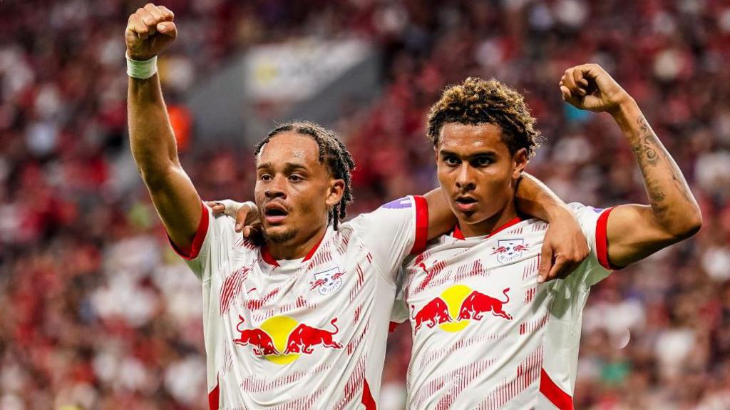
So when Red Bull joined the peloton in midseason, I was a little disappointed to see yet another set of clashing bulls on a blue field. Red Bull has done some pretty exciting work in red and white in its other signature sport, soccer. But I guess there’s a discount on blue dye at the cycling jersey factory.

Like all blue or navy cycling kits, the outfit itself looks fine, but it’s just so similar to everything else that’s being done. Which rankles especially with this team, as Bora—after something like a decade of snoozeworthy white, green and black kits—unleased the best non-EF jersey in the peloton last season.

3But no, I suppose all roads trend toward navy.
With that said, the 2025 kit…I think it looks very, very sharp. You’ll notice the prominent Hugo Boss sponsorship—I don’t know how much design input Boss had, but the white shoulders on this kit do evince a stylish boldness. “Look good, play good,” the saying goes.4
Especially because this kit isn’t actually going to be blue most of the time you’re watching it. Because on the back—the part of the jersey you’ll see from overhead shots and trailing motorcycle footage—it’s white.

And no, I’m not above making the obvious joke.

OK, one more stray observation about this kit, which I genuinely do like.
I’m sure all of you are familiar with the later seasons of Star Trek: Voyager. Well, in Season 7, Episode 3: “Drive,” you know, the one where Tom and Harry enter the Delta Flyer in the Antarian Trans-Stellar Rally,5 and Harry falls for yet another unavailable alien hottie, and Tom is one again so obsessed with his hobbies that he imperils his relationship with B’Elanna, and Harry has to foil the aforementioned unavailable alien hottie’s plan to bomb the finish line of the race, which would’ve killed thousands and thrust6 the entire sector back into war and chaos? And also Tom and B’Elanna get married at the end.
Well, in that episode, they reveal a unique Starfleet uniform, a kind of dual-purpose dress uniform and fireproof racing coveralls designed specifically for this event. Most Star Trek costumes of this vintage have a contrasting shoulder panel, only this one7 is white.

Anyway, that’s what the Red Bull kit reminds me of.
The rest of the peloton’s kits are starting to trickle out; usually that trickle becomes a deluge in early January, and EF swoops in at the last minute and blows everyone out of the water. I’ll highlight the other two more meaningful ones here:
First of all, Team dsm-firmenich PostNL8 is now Picnic PostNL. Picnic is apparently an online supermarket that put itself in SEO hell by choosing such a generic name, and in literary hell because that name should by all rights be a pun on Bytes.
The kit is…not great but not awful either. I usually like blue and orange together in a sports uniform context, but as I’ve said this sport needs another navy jersey like it needs a kick in the nuts, and the red Picnic logos clash terribly with the orange PostNL logos.
And then there’s this line from team CEO Iwan Spekenbrink in the press release announcing the new title sponsor: “Picnic’s key values—innovation, quality and promoting a healthy lifestyle—are naturally very close to ours.” I couldn’t run a World Tour cycling team. I don’t have the guts or the business sense, for starters, but most of all I have too much self-respect to have a sentence that starts with “Picnic’s key values…” attributed to me.
Cofidis, however, is starting off 2025 right.

I was a little leery of the new color scheme because of, again, brand identity. Cofidis is, I believe, the longest-tenured title sponsor on the World Tour, having stuck with the team since its foundation in 1997. Like, they raided Team Motorola for a young Lance Armstrong and Bobby Julich, and Julich made his Tour de France podium in 1998 in Cofidis colors.
Those colors, traditionally: Red and white. Sometimes with the bank’s starburst logo on a white background, or more latterly a red jersey with white shoulders. They’d already been moving away from that friendly logo to a more minimalist sans serif wordmark. Which I don’t love. I am genuinely an enormous fan of modern architecture and design, but this is of a piece with the aesthetic trend that led us to a world of square Taco Bells, and I won’t have it.
But I kind of love the colors. Do they work? Not really. The red and maroon is a little confused, and while the yellow sleeves are peppy and cheerful, it all looks like a random assortment of paint swatches. Nevertheless, 1) It’s not blue. And 2) It’s bright and bold. It’s instantly recognizable, which is the point of, well, a uniform.
Every team should be so direct.
In the words of one of my old J-school professors, who taught me almost everything I know about copy editing and style guides: “We don’t allow companies to shout from our pages”
Me? I think I’ve gotten to a point where I actually like the taste of Red Bull. Like, it might be so bad it’s good, but more than anything it’s distinctive in a way I find invigorating. I don’t know that I could drink more than eight ounces at a time, but based on my fondness for hot sauce and IPAs I think I might just like things that hurt to taste.
Not for nothing, I’d give a kidney to have a name as cool as “Gaetan Flamme”
Fortunately, this has not held true for every team Hugo Boss made uniforms for.
As a conceit, I love a random NASCAR episode in a sci-fi TV show
Haha, spaceship racing pun
I’m not doing the Elvis meme again
Speaking of vanity capitalization nightmares
I believe that the UCI in their infinite wisdom and given their history of making well informed decisions has placed restrictions on kit so as not to clash with leader jerseys in tours, and not just restricted to yellow, pink or red but also white, green etc
Doesn't leave a lot of room for teams to play with and try and satisfy their own sponsors at the same time
I would love to see more orange (🍊, my favorite color) in the peloton. It’s not just for Basques anymore.